When I first started learning CSS, I used to use margins in order to create gutters or space in between elements (we will use “boxes” for the remainder of this post) in a row, inside of a parent container.
This used to be somewhat challenging at first since I realized there was more than one way to achieve the desired result based on the how I wanted the boxes spaced out.
All four methods below use display: inline-block; for the display behavior. You can also float the boxes, as long as you make the necessary adjustments to the parent container.
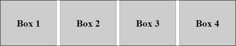
Aligning the first and last boxes on the edge of parent container
Using Margins
For each box, I am using a width of 24% with a right margin of -4px. The margin of -4px is needed since the browser adds extra “space” on the right side of each box when using display: inline-block;. Since I want the first box and last box in the row to touch the outer edges of the parent container, I have to set the left margin of the first box to zero, so that it sits along the left edge of parent container. Then using math, I divided 4 boxes/3 gutters to calculate the left margin of the remaining boxes which comes out to 1.333333333333333%. You can check this out below:
HTML
<div class="wrapper">
  <div class="box">Box 1</div>
  <div class="box">Box 2</div>
  <div class="box">Box 3</div>
  <div class="box">Box 4</div>
 </div>
CSS
.wrapper {
  width: 768px;
  margin: 50px auto;
  border:1px solid #000;
}

.box {
  display:inline-block;
  width: 24%;
  height: 150px;
  box-sizing: border-box;
  background-color: #cdcdcd;
  margin-right: -4px;
  margin-left: 1.333333333333333%;
  line-height: 150px;
  font-size: 2rem;
  font-weight: bold;
  text-align: center;
}

.wrapper > .box:first-of-type {
  margin-left: 0;
}
Using padding
With padding, some adjustments need to be made. We rename the class of “box” to “outer-box”, and create a child container and label that “inner-box”. Several CSS properties get moved from the .outer-box declaration to the .inner-box declaration. The left margins are removed from the outer boxes, which now have a transparent background. See the code below:
HTML
<div class="wrapper">
  <div class="outer-box">
    <div class="inner-box">Box 1</div>
  </div>
  <div class="outer-box">
    <div class="inner-box">Box 2</div>
  </div>
  <div class="outer-box">
    <div class="inner-box">Box 3</div>
  </div>
  <div class="outer-box">
    <div class="inner-box">Box 4</div>
  </div>
</div>
CSS
.wrapper {
  width: 768px;
  margin: 50px auto;
  border:1px solid #000;
}

.wrapper > .box:first-of-type {
  margin-left: 0;
}

.outer-box {
  display: inline-block;
  padding: 0 0.6666666666666667%;
  width: 25%;
  margin-right: -4px;
  height: 150px;
  text-align: center;
  box-sizing: border-box;
}

.inner-box {
  background-color: #cdcdcd;
  line-height: 150px;
  font-size: 2rem;
  font-weight: bold;
}

.wrapper > .outer-box:first-of-type {
  padding-left: 0;
}

.wrapper > .outer-box:last-of-type {
  padding-right: 0;
}
Result
Below is the visual of what both methods above produce:
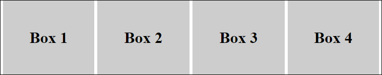
Evenly spacing the boxes inside the parent container
To evenly space boxes using display: inline-block;, it is easier to just use padding. You still have to account for the extra space that the browser will insert in between each box, therefore, you still need margin-right: -4px; to still be declared for the outer boxes.
To create equal spacing around all boxes, the left padding for the first box and right padding for the last box in the row, need to be double in size of the padding for the inside boxes. No CSS declarations get changed for the inner-boxes. See the CSS below:
CSS
.wrapper {
  width: 768px;
  margin: 50px auto;
  border:1px solid #000;
}

.outer-box {
  display: inline-block;
  padding: 0 0.3333333333333333%;
  width: 25%;
  margin-right: -4px;
  height: 150px;
  text-align: center;
  box-sizing: border-box;
}

.inner-box {
  background-color: #cdcdcd;
  line-height: 150px;
  font-size: 2rem;
  font-weight: bold;
}

.wrapper > .outer-box:first-of-type {
  padding-left: 0.6666666666666667%;
}

.wrapper > .outer-box:last-of-type {
  padding-right: 0.6666666666666667%;
}
Result
Once more, you can float the boxes inside the row, however, unless I have a need to, this is my preference. With floats, you can avoid using the margin-right: -4px; declaration, and make sure you make the adjustments to the parent since by default the height of the parent container would shrink due to the nature of floated elements.
NOTE: This post was written in 2016. You can also now use Flexbox and CSS grid to achieve the same results.